
Feature Wall Tiles in Noida: Choosing Texture, Pattern and the Right Light
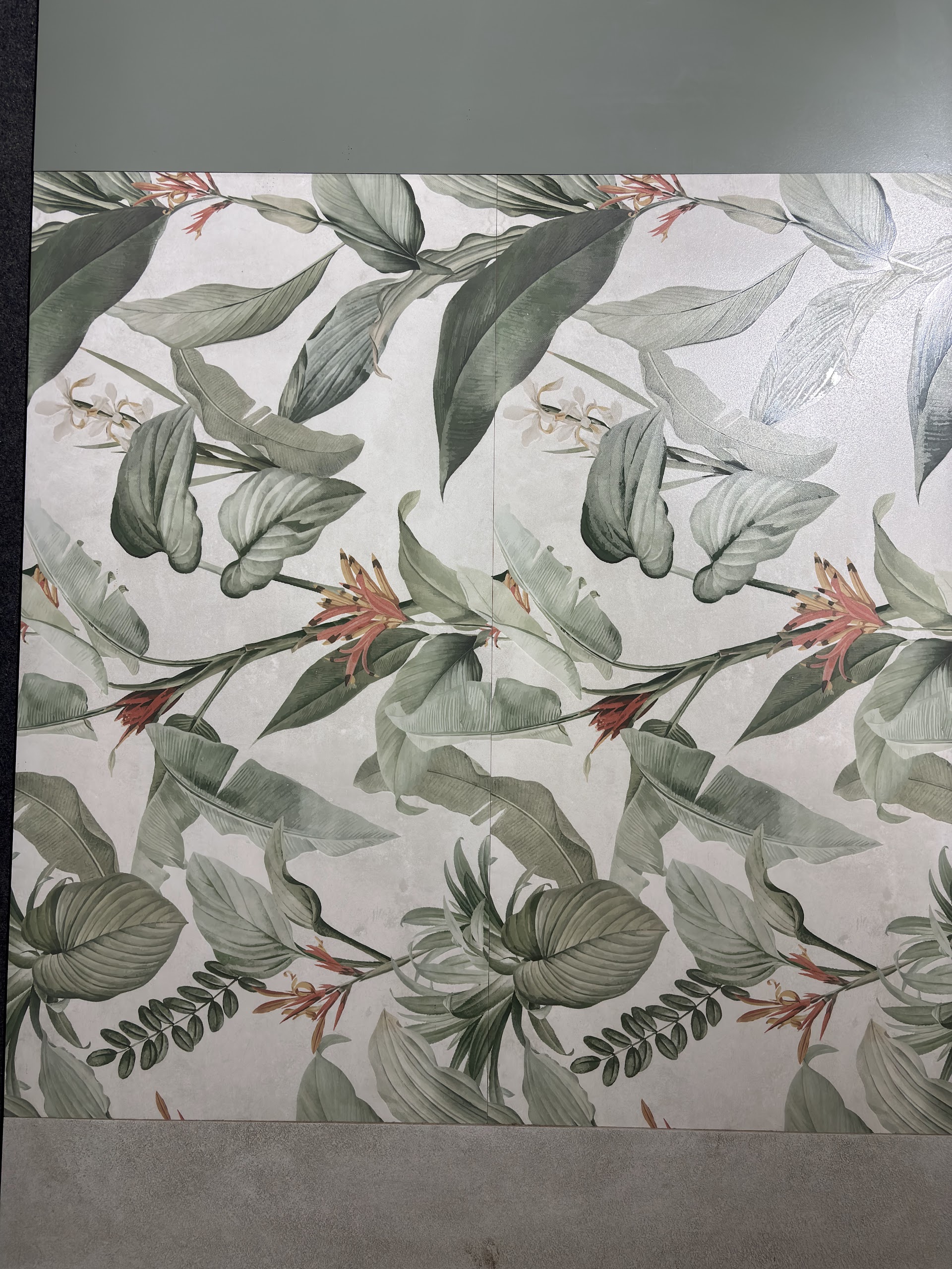
A feature wall changes the balance of a room without asking every surface to compete for attention. Behind a sofa, beside a dining table or at the end of an entrance passage, tile can introduce pattern, relief or a different response to light. The useful question is not which panel looks most striking on its own. It is which one still feels right beside your floor, furniture and lighting. These photographs from our showroom photoshoot show four different directions, and this guide explains how to choose between them.
Choose the wall before choosing the tile
Start with the surface that already holds the room together. In a living room this might be the wall behind the sofa, rather than the television wall crowded with cables and cabinetry. In a dining space it could be the uninterrupted wall seen from the entrance. A small foyer often needs only one clearly defined panel, not a patterned treatment wrapped around every corner.
Measure the full width and height, then mark everything that interrupts the surface: doors, switches, sockets, air-conditioning units and furniture. A pattern that looks balanced on a complete showroom panel may lose its centre when a cupboard covers the lower half. Decide which part of the wall will actually remain visible before selecting a design.
Think about the main viewing distance too. A broad leaf print reads across a room. Fine relief rewards a closer view. Neither is inherently better, but the wall at the end of a long passage has a different job from a surface beside a reading chair.
Botanical patterns: give the design room to breathe
The first photograph shows a decorative tile composition built around leaves and flowers. Its pale background leaves space between the green forms, so the panel feels lighter than an all-over dark print. In a room, this kind of surface can work with plain upholstery and cabinetry that picks up one of the quieter colours in the pattern.
Avoid selecting matching prints for the curtains, rug and cushions simply because they share the same motif. A patterned wall is often more convincing when the surrounding materials are restrained. Take a floor sample with you and compare undertones: a cool grey floor and a warm off-white background can look different together than either does in isolation.
Ask whether the design is supplied as a repeating tile, a collection of different faces or a numbered mural. The answer affects both ordering and layout. Where a composition relies on specific adjoining pieces, approve the complete panel arrangement before anything is fixed to the wall.
Quiet texture: let light reveal the detail
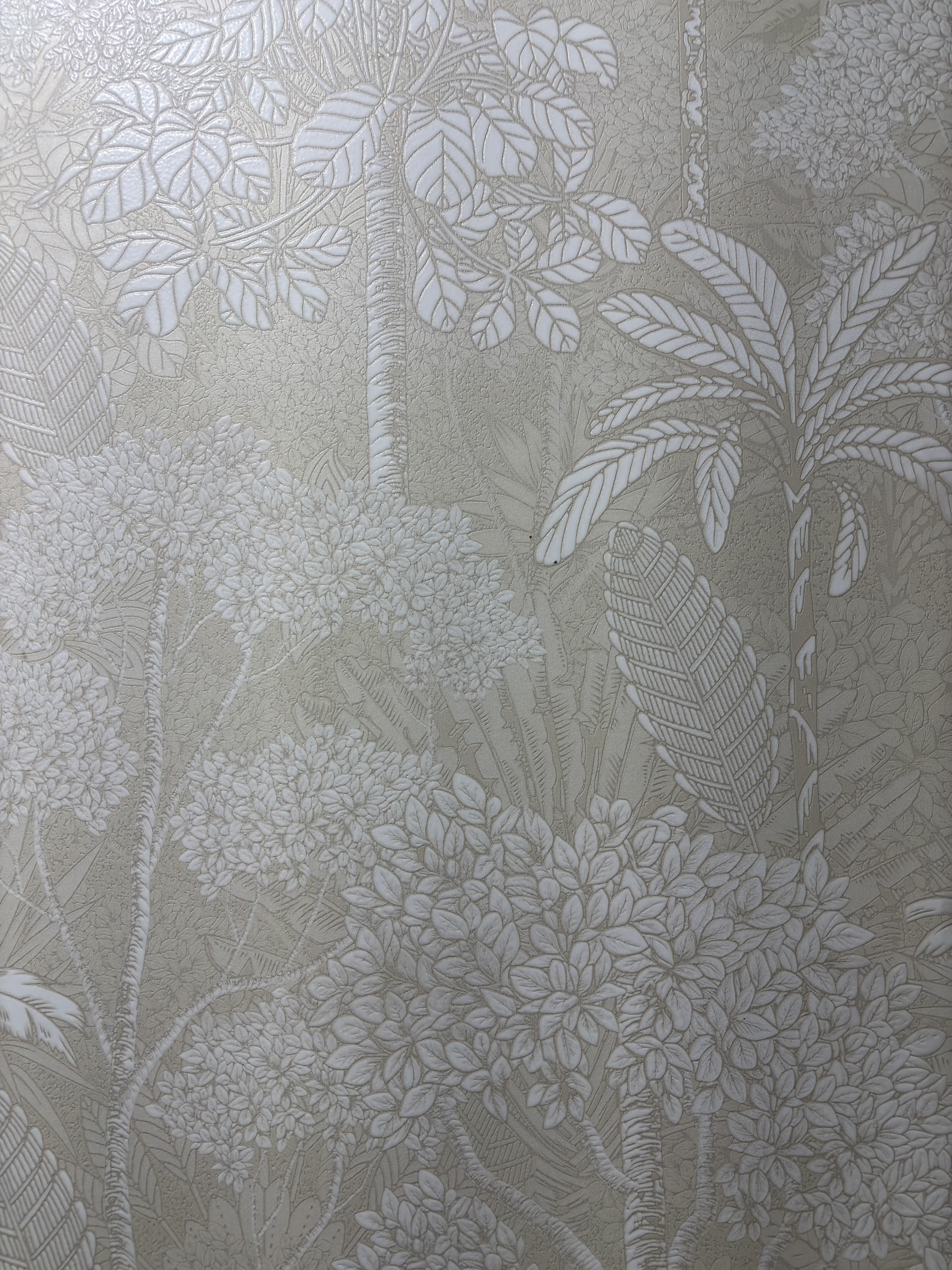
A textured tile can create a focal point without introducing a bold colour. In this close-up, the floral detail sits within a narrow tonal range. The surface is interesting because its raised and recessed areas respond differently to light, not because it carries a large graphic print.
That makes lighting part of the selection. Light falling across the surface can reveal relief; light aimed straight at it may flatten the effect. Before committing, look at the sample under illumination similar to the room's final arrangement. If wall lights or a ceiling cove are planned, discuss their position with the designer before the tile layout is signed off.
Texture also changes cleaning. A shallow pattern is different from deep grooves that can collect dust. Ask for the manufacturer's care guidance, particularly if the wall is near a cooking area. For a shower or another continuously wet position, confirm that the individual product is approved for that use rather than assuming every decorative wall tile is suitable.
Geometric relief: check the rhythm at full scale
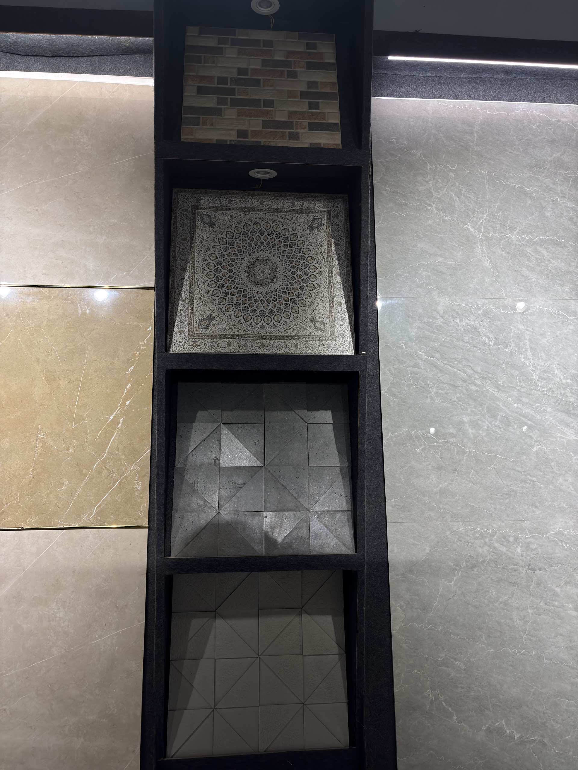
Geometric surfaces bring a more ordered rhythm. The display above places smaller relief samples between quiet large panels. It is a useful reminder that a decorative treatment does not have to cover an entire room to have presence. A defined strip or a single wall can make a stronger composition than several unrelated accent surfaces.
Look at several pieces together. Check where the pattern meets the grout joint and whether rotating a tile changes the design. Some patterns need a consistent direction; others allow a deliberate variation. Do not leave that choice to chance during installation. Photograph the approved arrangement and make sure the installer can identify the orientation of each piece.
Consider switches, sockets and shelves as part of the geometry. A socket placed in the middle of a repeating motif can interrupt it more noticeably than it would on a plain tile. Plan cuts and fittings together, keeping useful access without sacrificing the wall's visual order.
Stone-finish texture: depth without a busy print
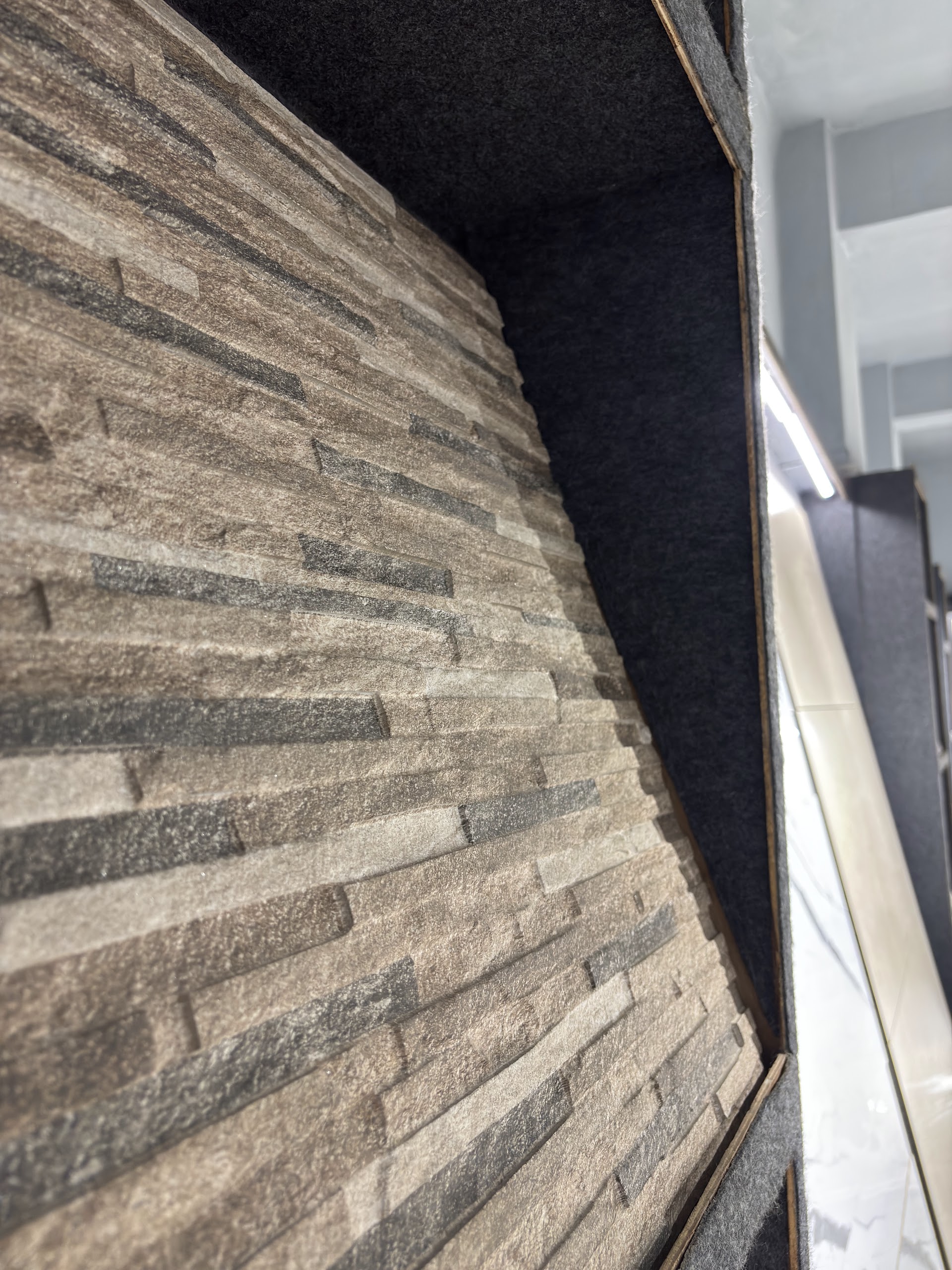
The final photograph shows a layered stone-finish tile surface. Its horizontal ridges give it a different character from a printed botanical panel: the interest comes from depth, shadow and small shifts in tone. Beside smooth painted walls or uncomplicated furniture, it can add material contrast without another strong pattern.
Keep the distinction clear when ordering. This is a tile with a stone finish, not a promise that the product is natural stone. Confirm the tile's actual material, weight and intended application. An indoor display photograph does not establish that a product is suitable for an exterior facade, a wet wall or a particular fixing system.
Ridged surfaces need a considered termination at the edges. Discuss how the panel will meet painted plaster, door frames and inside corners. A deliberate border or return is usually more resolved than an exposed cut edge discovered after installation.
Compare the four directions
| Direction | What creates interest | What to check |
|---|---|---|
| Botanical print | Colour and broad graphic forms | Panel sequence, cuts and surrounding colours |
| Subtle floral texture | Fine relief and changing highlights | Lighting angle and cleaning requirements |
| Geometric relief | Repeated shapes and ordered rhythm | Orientation, joints and fitting positions |
| Layered stone finish | Depth and horizontal tonal variation | Edge details, weight and application approval |
Make the floor and wall work together
The wall and floor do not need to match. They need a relationship. That might be a shared warm undertone, a common grey or a contrast between a smooth floor and a textured wall. If the floor already has dramatic marble-finish veining, a quieter feature wall may be the stronger choice. If the floor is plain, the wall has more room for a pattern.
Compare samples vertically and horizontally, not flat beside each other on a counter. Surfaces receive light differently depending on their orientation. Look again in daylight and under the lighting you expect to use in the evening. A phone photograph helps record the shortlist, but screen brightness and white balance make it a poor final colour reference.
Before placing the order
- Confirm the product's material, dimensions, finish and approved location of use.
- Approve an elevation showing tile positions, cuts, joints and visible edges.
- Check the design sequence and whether all pieces must come from a matching batch.
- Have the installer specify the substrate preparation and compatible adhesive.
- Calculate spare pieces from the actual layout, especially for numbered decorative panels.
- Confirm availability, delivery arrangements and the complete quotation before payment.
A feature wall is a modest area compared with a whole floor, but that makes mistakes more visible, not less important. Spend time on the arrangement, lighting and edges. The best result is a surface that belongs to the room, rather than a panel that looked impressive only under showroom spotlights.
Frequently asked questions
Which tiles work best for a living room feature wall?
Start with the wall's proportions, lighting and furniture. A botanical print can become the room's focal point, while a subtle textured tile gives a quieter result. Compare full panels rather than choosing from a small sample, and confirm the product is suitable for the wall and installation method.
Can textured wall tiles be used in a bathroom?
Some can, but suitability depends on the individual product. Confirm wet-area approval, cleaning requirements and the installation system. Deep relief is usually easier to maintain away from direct shower spray, where soap residue and water deposits collect.
Should a feature wall use the same tiles as the floor?
It does not have to. Sharing a colour or undertone often gives enough continuity. A quiet floor can balance a patterned wall, while a floor with strong veining generally works better beside a restrained wall.
How do I check whether a patterned tile will repeat well?
Ask to see several pieces together in their intended order and orientation. Check whether the design is a repeating pattern, a random-face series or a numbered mural. Approve the complete arrangement and grout joints before installation starts.
What should I bring when choosing wall tiles at the showroom?
Bring the wall's width and height, photographs taken in daylight and with the room lights on, and samples or photographs of the floor, furniture and cabinetry. Mark sockets, doors, mirrors and other interruptions on a simple elevation.
Do feature-wall tiles need special adhesive?
The adhesive must suit the tile material, size, weight, substrate and location. Ask the installer to follow the tile and adhesive manufacturers' specifications. Large or heavy panels may require a specialist installation method rather than a standard wall-tile approach.
Compare the complete surface before choosing. Bring your wall dimensions, room photographs and a floor sample to World of Tile in Sector 9, Noida. Use the actual displays to compare pattern, texture and light, and confirm current availability with the team.
Plan a showroom visit